Breakout
- XCode
- Twine
- UI Designer
- Writer
- Developer
- Fall 2018
- 2 Weeks
Tools Used
Project Role
Time
A short, sci-fi, “choose your own adventure” prototype made in XCode.
Challenge
As an introduction to using XCode’s interface builder, I was tasked with creating an interactive narrative, centered around a speculative or alternate future.

Prototype
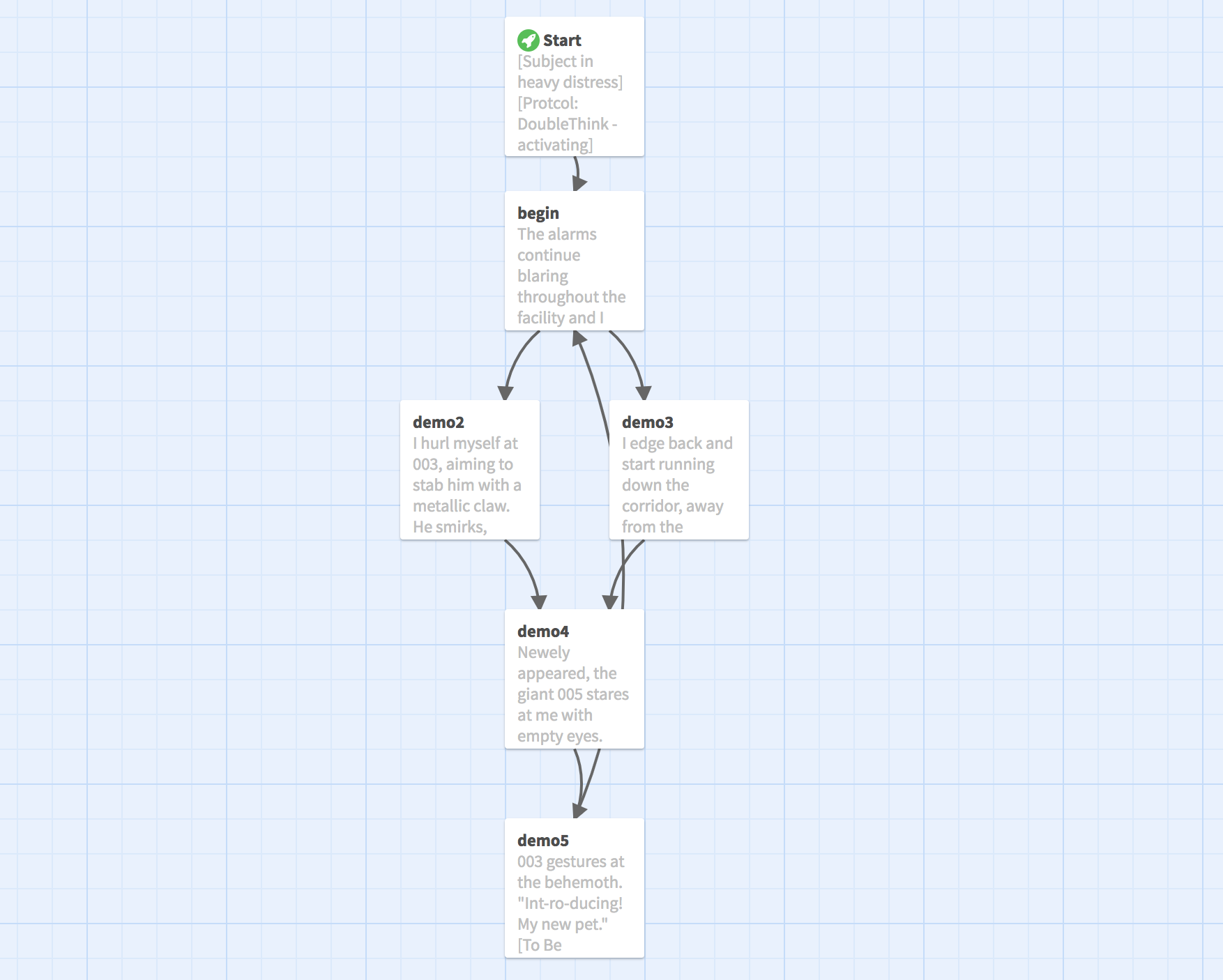
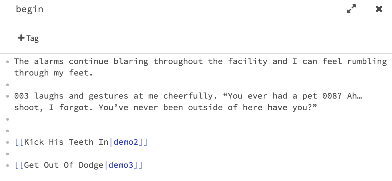
I began writing a story outline with the software Twine, in an attempt to plan out plot threads before implementing them into Xcode. I wrote a story snippet that was well into motion before the player had even started the game, wondering how players would react to the abrupt nature of the narrative. Taking control of the main character mid-conversation, I hoped that players would find themselves wildly startled and intrigued. Following this idea, I went into the designing phase of the project by trying to allude that the user was connecting with the main character’s perceptive functions via an unknown technology. The first few screens of the game would use a unique font style and systematic writing style to exemplify the concept of “connecting to someone’s live-feed experience” through technology. The same concept was used for the game’s “end screen”. Regardless of previous story events, the end screen would always read, “Session Ended”, to symbolize that the narrative is still continuing, even though the user has become unable to witness it.The visual experience of the first prototype was minimalist, relying only on a white and black palette. This approach was taken with the confidence that a more characterizing visual style could be implemented later on. While the minimalist style was appealing, it was too clean and organized to represent the decaying prison environment, or the technological nature of the story’s “live-feed” undertones. At this point, I decided to change the color of font for each character’s dialogue, enabling readers to follow the exchanges slightly better. This use of color stuck out like a sore thumb against the prototype background, but it served its purpose nonetheless.


Feedback
Testing the prototype for the first time, my peers found the narrative’s abrupt beginning intriguing, but also pointed out that the situation’s lack of context detracted from the meaningfulness of the early game’s choices. In addition, players found that the interfaces’ ease of use was often detrimental to the overall experience, because the lack of visual signifiers made skipping through dialogue and choices all too easy. Users reported that the use of unique text color for different character’s dialogue was useful, if not visually clashing to the game’s style.Updating
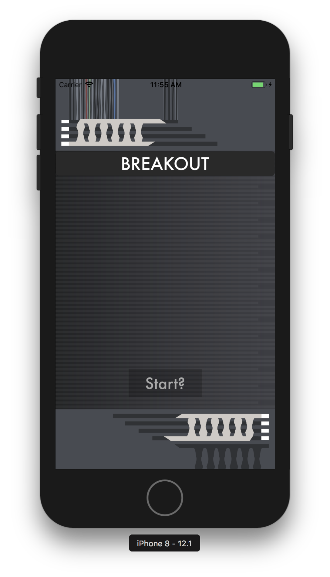
Taking the critiques I had collected into account, I decided to keep the narrative’s beginning “mood” the same. Prioritizing the game’s hook, I made sure that most of the choices at the beginning of the game were less about impacting the narrative, and more about informing the player of the environment around them. I also made sure to develop a more unique visual theme for the game, implementing a dark, wiry, computer screen esque background.

